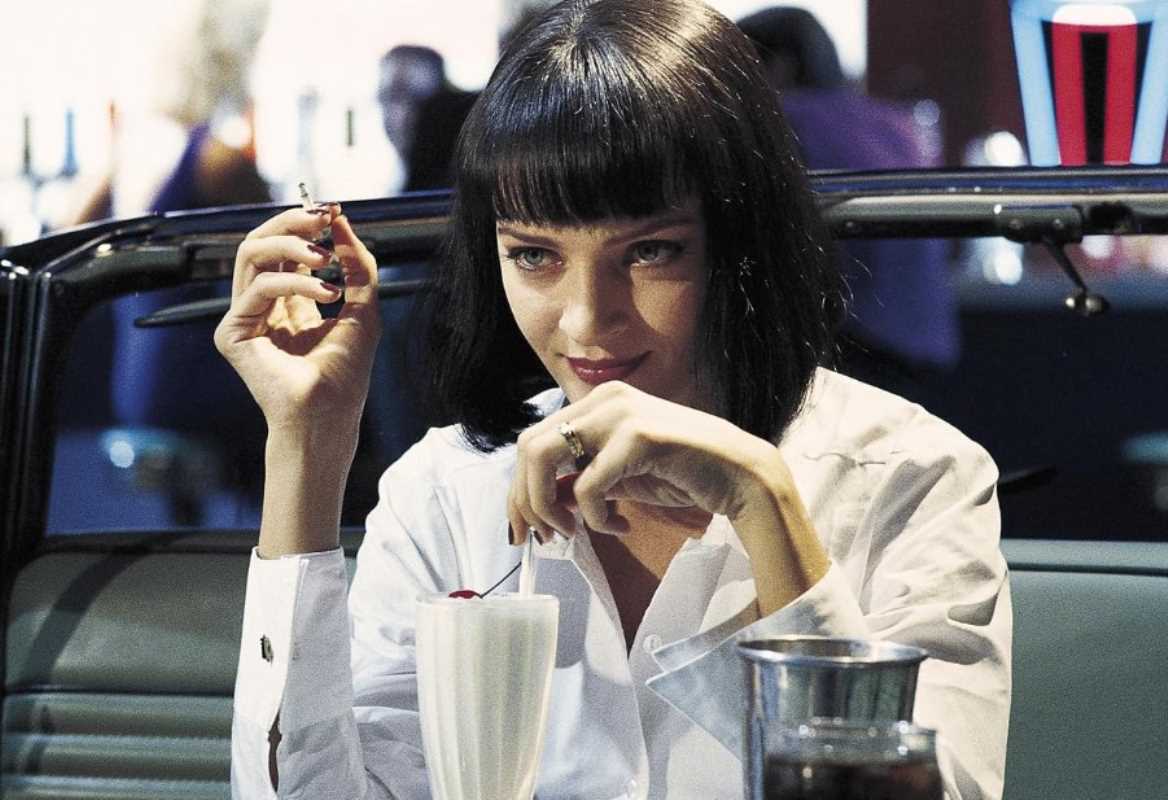
 (Image source: Focus Features)
 Art direction is a foundational component in the disciplines of filmmaking and television production, serving as the primary mechanism for constructing the visual world of a narrative. It encompasses the comprehensive aesthetic of a production, from the architectural design of sets to the specific selection of props and color palettes. Over the past decade, certain productions have exhibited exceptional art direction, creating immersive, thematically resonant, and culturally significant visual experiences. This analysis will examine the superior art direction of specific works, including The Grand Budapest Hotel, Game of Thrones, and Dune, to provide a clear understanding of their narrative contributions and industry influence.
The Function of Art Direction in Narrative Construction
Art direction, executed by a production designer and their department, is the process of translating a script’s narrative and thematic elements into a tangible, visual reality. This requires a precise and intensive collaboration with the director, cinematographer, and other creative teams to ensure a cohesive aesthetic. The objective is to build a world that not only appears authentic within its own logic but also actively serves the story. The color of a wall, the style of a chair, or the scale of a landscape are all deliberate choices designed to communicate character, evoke emotion, and reinforce the core themes of the production.
The Grand Budapest Hotel (2014): Meticulous Symmetry and Color
While released just prior to the specified period, the influence of Wes Anderson's The Grand Budapest Hotel on the art direction of the last decade is indisputable. Production designer Adam Stockhausen, under Anderson’s exacting vision, created a world defined by its meticulous symmetry, intricate detail, and purposeful color palettes. The film utilizes different aspect ratios and color schemes to delineate its multiple timelines. The 1930s are presented in a vibrant palette of pinks, purples, and reds, reflecting an era of opulent grandeur. The 1960s shift to a more subdued scheme of oranges, greens, and browns, signifying a period of decay. This structured use of color provides immediate visual cues to the audience about the temporal setting and its corresponding mood. The film’s obsessive symmetry and diorama-like compositions create a heightened, storybook reality that remains a benchmark for stylized world-building.
Game of Thrones (2011–2019): Comprehensive World-Building
Throughout its run, a significant portion of which falls within the last decade, Game of Thrones set a new industry standard for the scale and detail of its art direction. Production designer Deborah Riley was responsible for realizing the disparate and expansive continents of Westeros and Essos. The success of the series' art direction lies in its creation of distinct and believable cultural identities for each location. The cold, stark, and brutalist architecture of Winterfell, built with formidable gray stone, reflects the stoic and resilient nature of House Stark. In contrast, the opulent Red Keep in King's Landing features warm sandstone, intricate tilework, and Mediterranean influences, communicating the wealth, power, and decadence of the Lannisters. Each location possessed a unique architectural language, color palette, and material culture, from the sigils on armor to the design of furniture. This comprehensive approach to world-building ensured that each setting felt historically and culturally grounded, allowing for unparalleled audience immersion in its complex narrative.
Dune (2021): Epic Brutalism and Otherworldly Landscapes
Denis Villeneuve’s Dune required art direction capable of conveying a sense of immense, almost incomprehensible scale. Production designer Patrice Vermette developed a visual style that blended brutalist architectural principles with natural, organic forms to create the film’s otherworldly aesthetic. The designs for the planet Arrakis are defined by colossal, monolithic structures that appear carved from the desert itself, dwarfing human figures to emphasize the unforgiving nature of the environment and the formidable power of the Imperium. The color palette is deliberately constrained, dominated by the pale sands of the desert and the gray metallics of the machinery and architecture. This minimalist approach avoids visual clutter, focusing the audience’s attention on the epic scale and stark beauty of the alien landscapes. The art direction of Dune is a definitive example of using design to establish tone and convey power dynamics on a galactic scale.
Nosferatu: Shadows and the Birth of Expressionist Design
Although predating the other examples by nearly a century, Nosferatu (1922) remains one of the most influential works in the history of art direction and visual storytelling. The film’s production designer, Albin Grau, and director F.W. Murnau employed German Expressionist techniques to craft a nightmarish world defined by stark, exaggerated shadows, distorted architectural forms, and an unsettling sense of unreality. The deliberate use of lighting and shadow in Nosferatu transformed basic sets into haunting landscapes, where elongated silhouettes and jagged angles heightened the film’s atmosphere of fear and supernatural dread.
This approach intensified the horror surrounding Count Orlok and established foundational visual motifs that continue to inform modern cinematography and production design. The film’s legacy is evident in countless subsequent works—its shadow play and expressionist principles have been adopted across genres to evoke psychological tension and otherworldliness. In so doing, Nosferatu has secured its place as a seminal reference point for visual stylization in film and television.