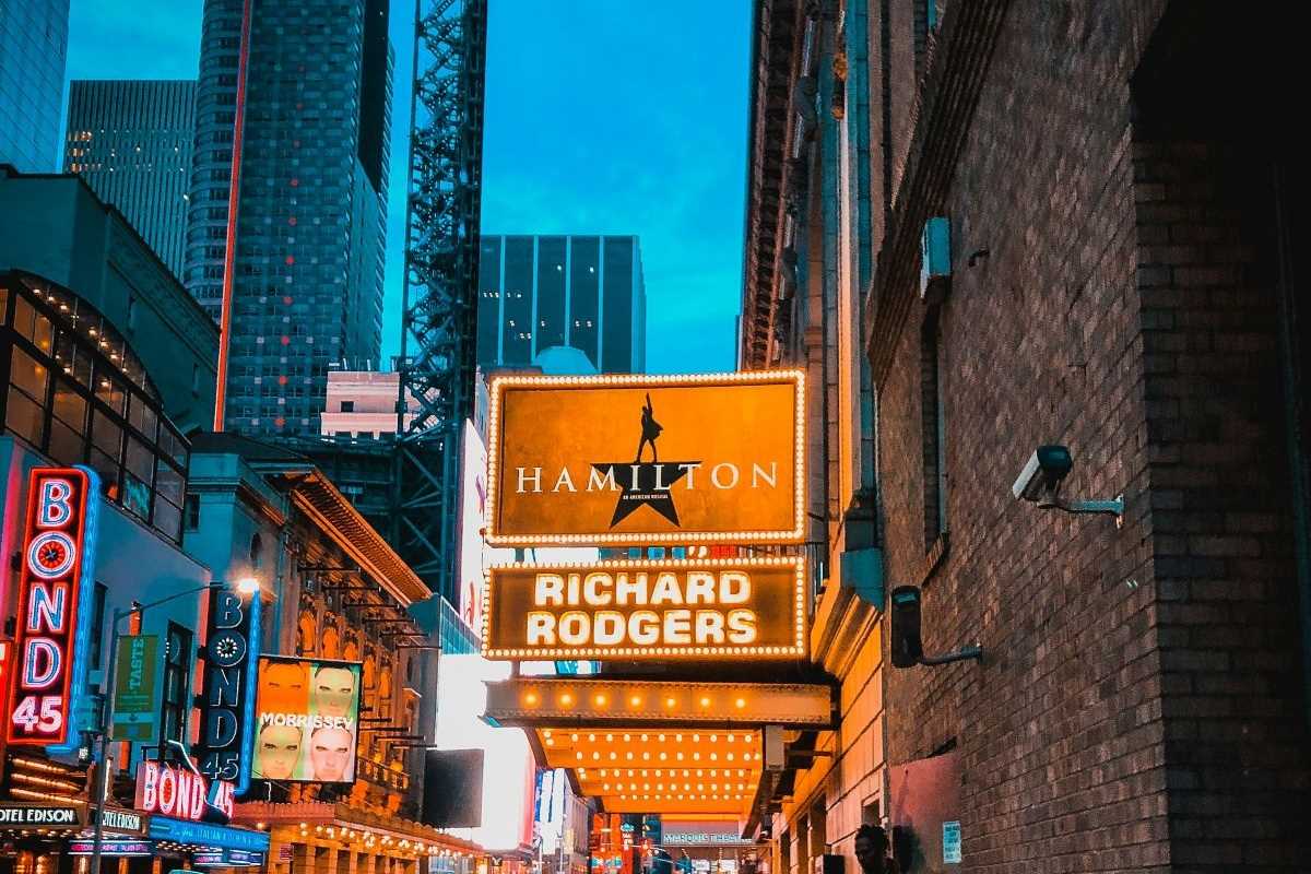
 (Image source: Claudie Ossard Productions)
 In the discipline of visual storytelling, color functions as a primary and highly sophisticated instrument for influencing audience perception. The selection of a color palette is not an arbitrary aesthetic choice; it is a deliberate and calculated process designed to evoke specific emotional responses, convey thematic underpinnings, and guide the narrative. An in-depth examination of this technique reveals a complex interplay of psychological principles, cultural associations, and artistic intent. This analysis will provide a structured explanation of how filmmakers and designers leverage color to manipulate emotion, supported by specific examples from cinematic and theatrical works.
The Psychological and Cultural Basis of Color
The human response to color is rooted in both innate psychological reactions and learned cultural associations. Certain colors elicit near-universal physiological responses. For instance, long-wavelength colors such as red and orange are physically stimulating, capable of increasing heart rate and respiration, which often translates to feelings of passion, aggression, or urgency. Conversely, short-wavelength colors like blue and green tend to have a calming effect, associated with serenity, stability, and introspection.
However, these foundational responses are further nuanced by cultural context. While white is associated with purity and weddings in many Western cultures, it is the color of mourning in numerous Eastern cultures. The efficacy of a color palette is therefore dependent on a production designer’s understanding of these dual frameworks—the universal psychological impact and the specific cultural lens of the target audience. A master of the craft uses this knowledge to construct a visual language that communicates directly with the audience's subconscious.
Monochromatic Palettes and Accent Colors
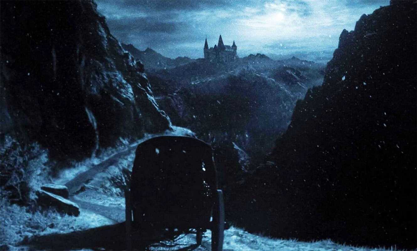
A monochromatic palette, or the near-total absence of color, is a potent tool for establishing a stark, oppressive, or timeless atmosphere. The stark black-and-white cinematography of Mad Max: Fury Road (Black & Chrome Edition) strips the post-apocalyptic world of any vibrancy, emphasizing the desolation and brutalism of the environment. This absence of color forces the audience to focus on texture, form, and the raw mechanics of survival, rendering the world harsh and unforgiving.
Within such a constrained palette, the introduction of a single accent color becomes an incredibly powerful narrative device. In Steven Spielberg’s Schindler's List, the film is presented almost entirely in black and white, documenting the horrors of the Holocaust with stark realism. The singular appearance of a young girl in a red coat—a color digitally added in post-production—is a moment of profound impact. Red, a color of vitality, innocence, and life, creates a jarring contrast against the monochrome desolation. This specific choice focuses the audience's attention and emotion, transforming the girl from an anonymous victim into a symbol of individual tragedy amidst mass atrocity. The color isolates her, makes her fate personal to the viewer, and underscores the film’s central theme of lost innocence.
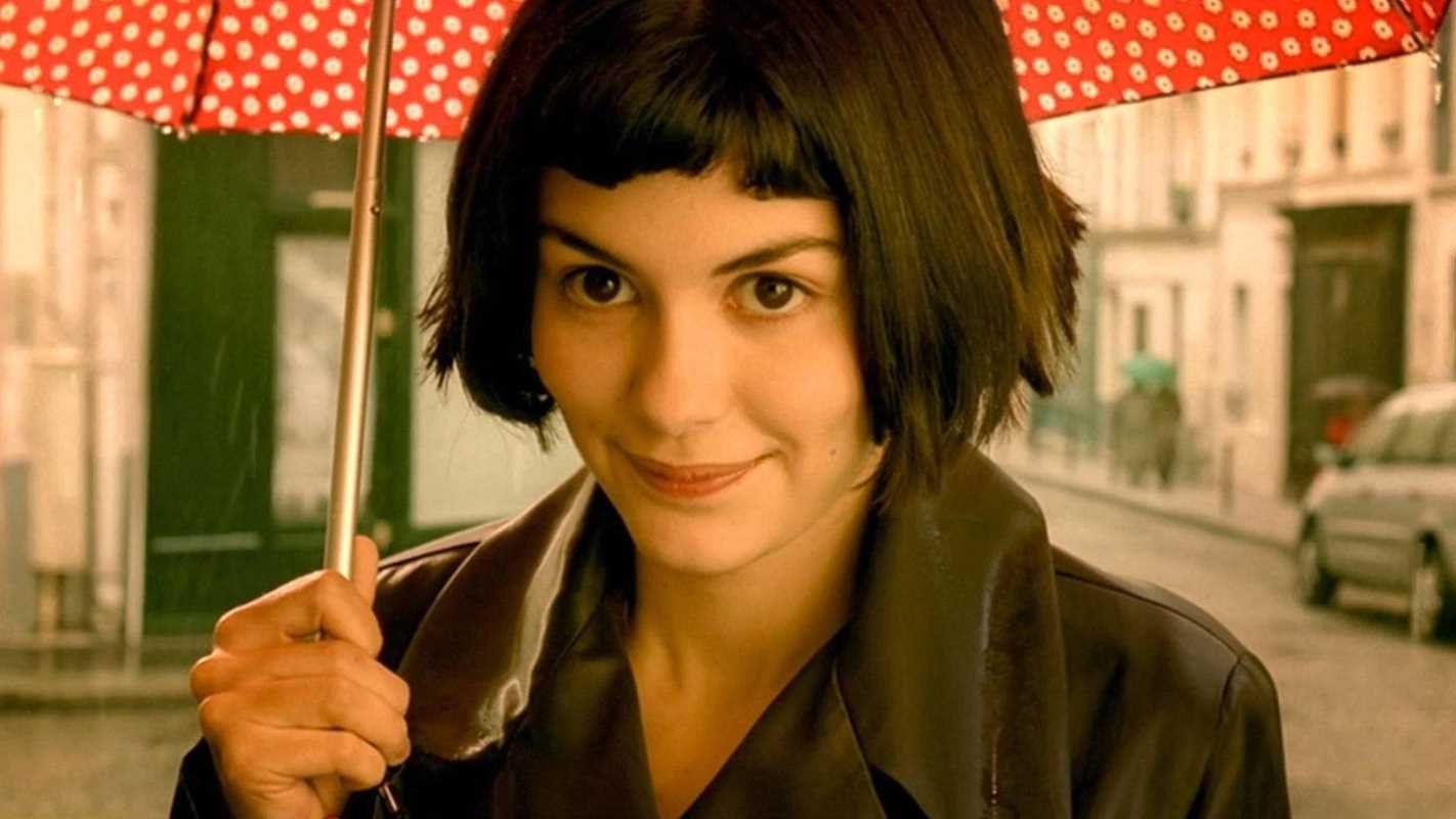
Saturated, Warm Palettes for Whimsy and Nostalgia
In direct opposition to the austerity of monochrome, a heavily saturated, warm palette can be used to construct a world of heightened reality, optimism, and charm. Jean-Pierre Jeunet’s film Amélie is a definitive example of this technique. The film is dominated by a rich palette of reds, greens, and golden yellows. This deliberate color scheme imbues Paris with a sense of magic and whimsy that exists outside of reality. The warm tones create a feeling of comfort, romance, and nostalgia, perfectly mirroring the protagonist’s optimistic and imaginative worldview. Every frame is meticulously art-directed to conform to this palette, ensuring the audience is consistently enveloped in Amélie’s idealized version of the world. The color is not merely decorative; it is the primary mechanism through which the film’s whimsical and heartfelt tone is established and maintained.
Analogous and Complementary Palettes for Harmony and Conflict
Color palettes can also be constructed around formal color theory to represent character relationships and thematic tensions. Analogous color schemes, which use colors adjacent on the color wheel, create a sense of harmony and visual cohesion. A film might use shades of blue, green, and teal to depict a tranquil or unified community.
Conversely, the use of complementary colors—those opposite each other on the color wheel, such as red and green or blue and orange—is a classic method for creating visual tension and signaling conflict. In theatrical productions, a protagonist might be costumed in a cool blue while their antagonist appears in a fiery orange. This visual opposition immediately and subliminally communicates their adversarial relationship to the audience before a single line of dialogue is spoken. The visual discord of the complementary colors creates an intrinsic sense of unease and opposition, reinforcing the narrative conflict on a purely visual level.